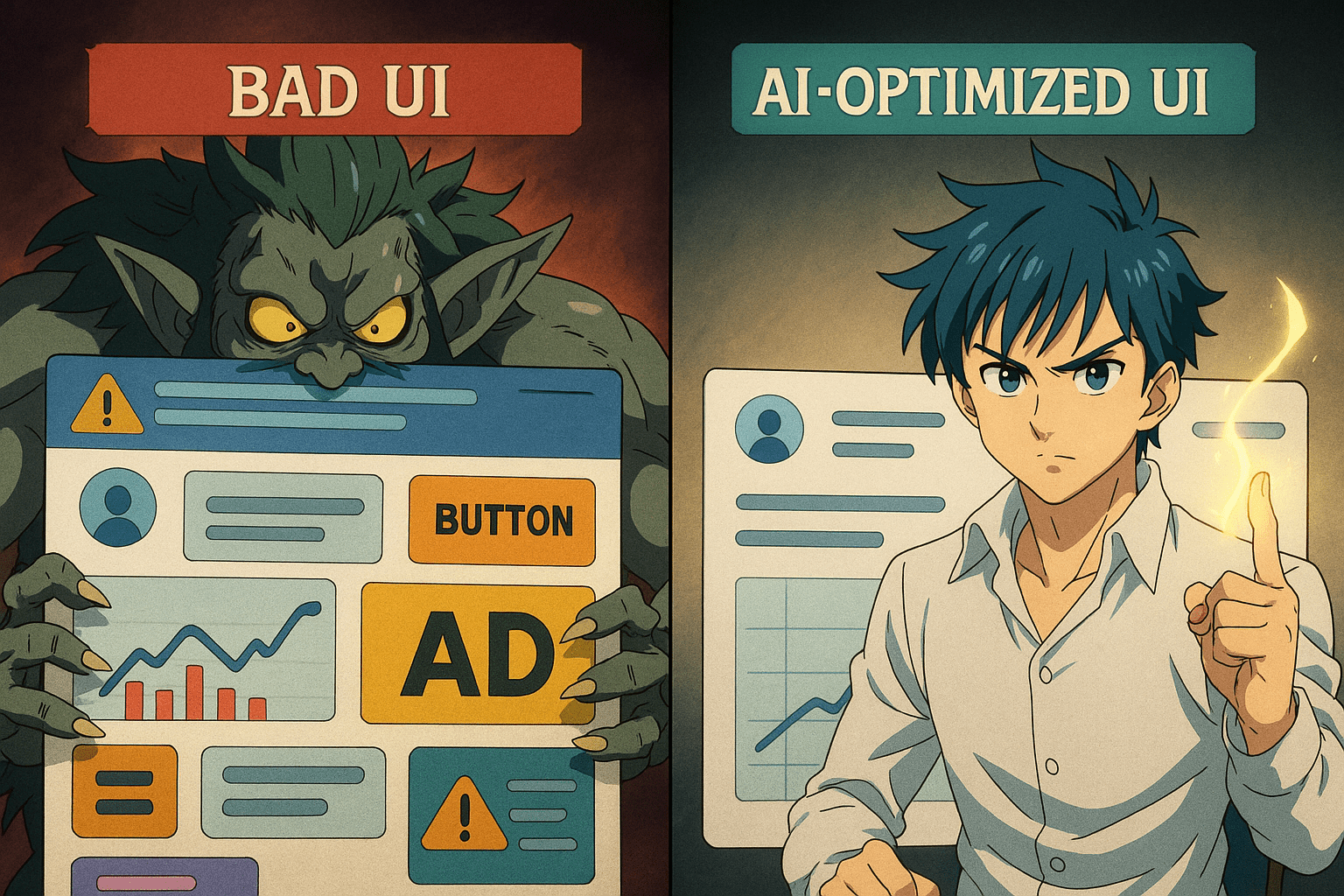
The 7 Deadly Sins of UI Design (And How AI Fixes Them Overnight)
UI design isn’t rocket science… until you open your favorite app and suddenly feel like you’re piloting a spaceship with 1,000 unlabeled buttons.
Eric Barker
Posted on 12/1/2025
If you’ve ever rage-quit a website, sighed at a mobile app, or squinted at a font smaller than an ant’s résumé, congratulations — you’ve witnessed the 7 Deadly Sins of UI Design. But fear not: today’s AI tools can fix them faster than you can say “Why is Comic Sans still a thing?”

1. Cluttered Interfaces: The Hoarder’s Special
The Sin: Every square inch is crammed with buttons, sliders, ads, and pop-ups. The screen feels like it’s yelling at you.
The AI Fix: AI-powered layout optimizers (like Uizard, Galileo AI) can instantly declutter by identifying redundant elements and reorganizing your interface for a clean, modern look.
Quick Fix: If your UI looks like Times Square on New Year’s Eve, run it through an AI layout audit and keep only what sparks joy.
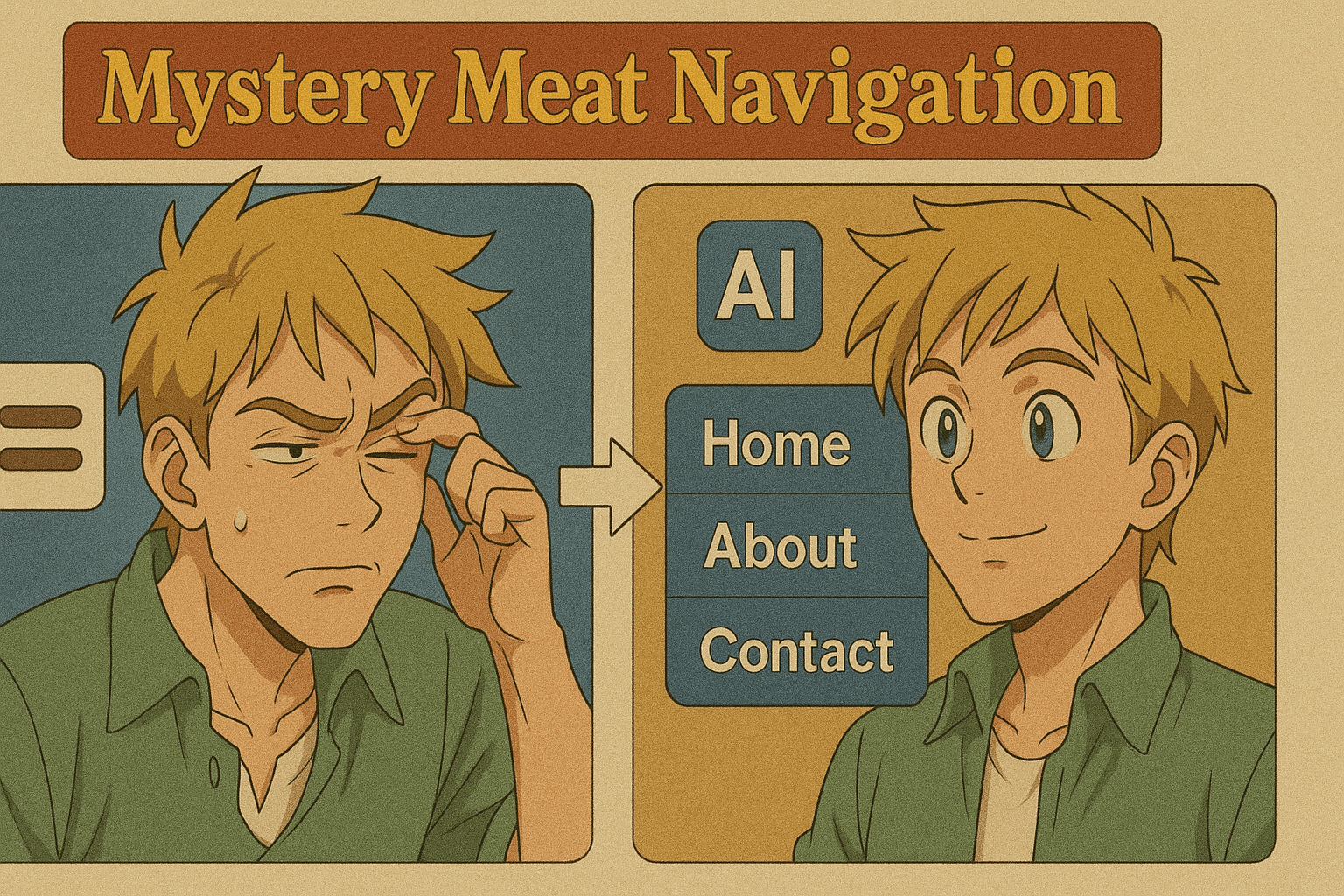
2. Mystery Meat Navigation
The Sin: Menus that hide critical features behind cryptic icons (looking at you, triple-dotted hamburger menus).
The AI Fix: AI-driven usability testing tools like Maze can predict where users will click, revealing which icons actually confuse people.
Quick Fix: Replace guesswork icons with clear, AI-suggested labels. Unless your goal is to create an escape room.
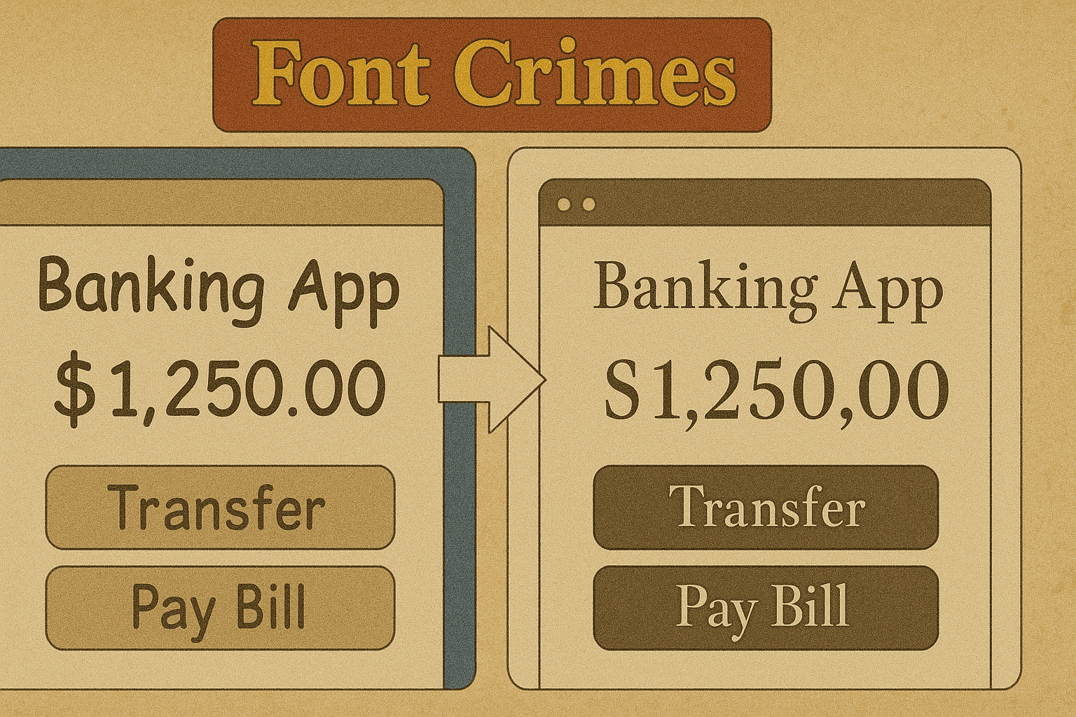
3. Font Crimes
The Sin: Comic Sans for a bank. Papyrus for a luxury brand. Or fonts so small you’d need the Hubble Telescope to read them.
The AI Fix: AI typography checkers can suggest better font pairings, sizes, and weights based on your brand style and accessibility needs.
Quick Fix: Test your fonts with an AI readability tool — if it suggests “increase size by 30%,” listen. Your users’ eyes will thank you.
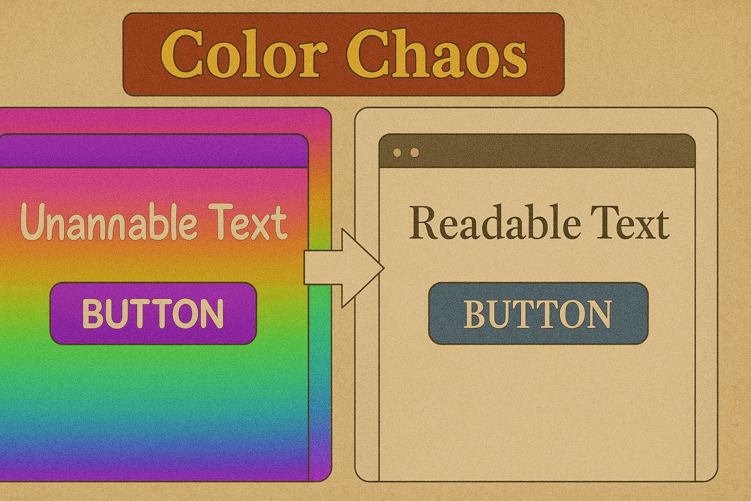
4. Color Chaos
The Sin: Backgrounds that clash with text like two toddlers fighting over a crayon.
The AI Fix: Tools like Khroma or Colormind use AI to generate harmonious palettes based on your brand and audience psychology.
Quick Fix: Let AI test color contrast ratios so your buttons don’t vanish for colorblind users (or sober ones).
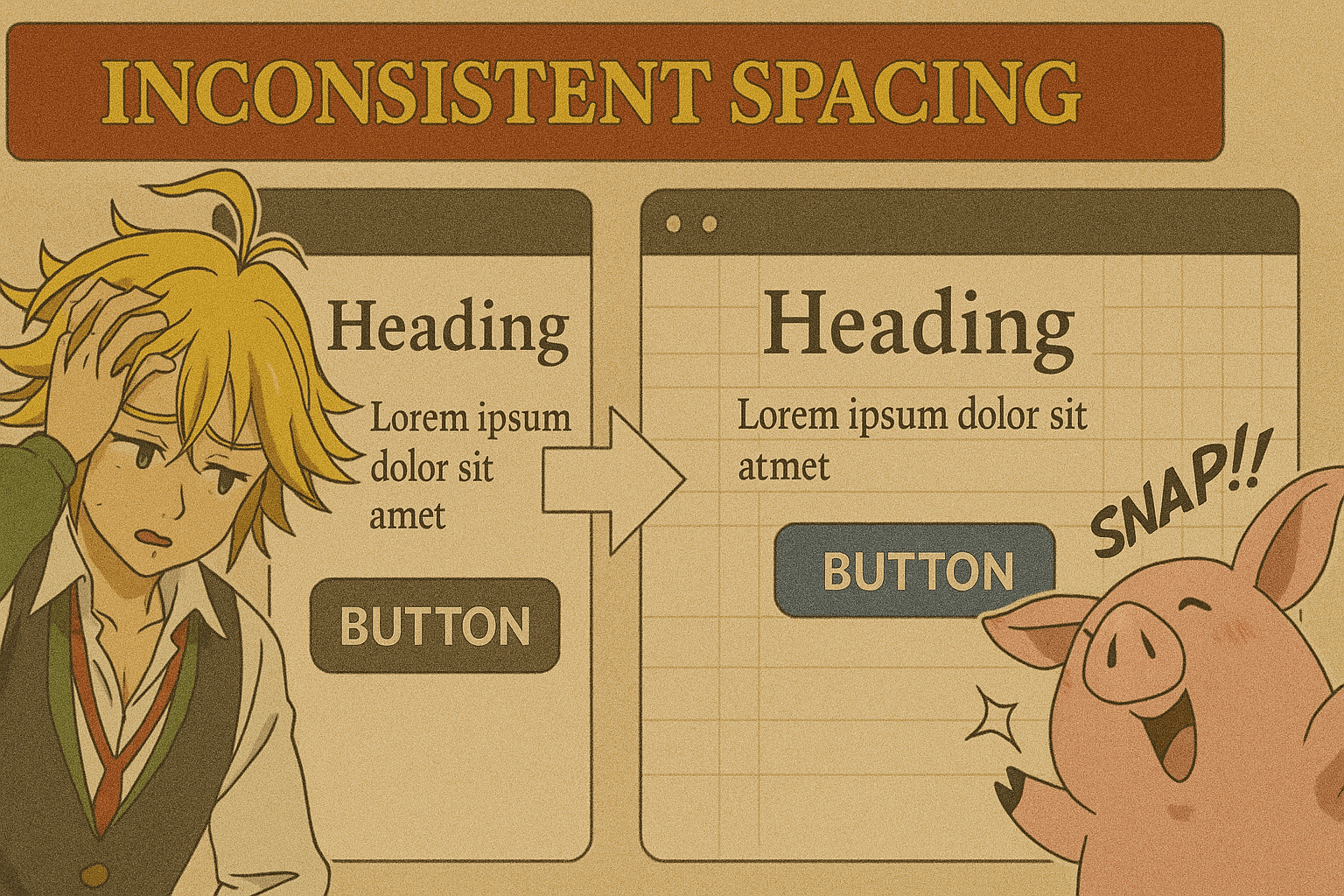
5. Inconsistent Spacing
The Sin: Margins that change more often than your Netflix password.
The AI Fix: AI design systems can automatically detect spacing inconsistencies and apply a uniform grid.
Quick Fix: Let AI “snap” elements to perfect alignment — because your OCD users are silently judging you.
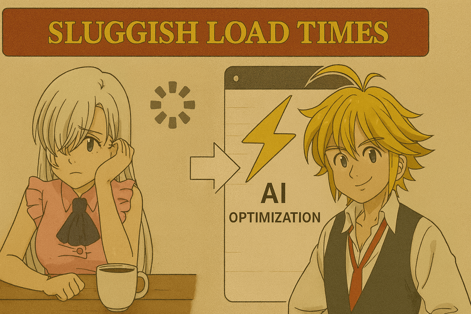
6. Sluggish Load Times
The Sin: A page so slow you can make coffee while it loads. Twice.
The AI Fix: AI image optimizers (like TinyPNG AI) compress assets without killing quality, and AI-based code cleaners strip out the bloat.
Quick Fix: Run an AI speed audit — shave off every millisecond possible. Your bounce rate will thank you.
7. Ignoring Accessibility
The Sin: Designing for people who see, hear, and interact exactly like you do.
The AI Fix: AI accessibility checkers can simulate disabilities to highlight where your design fails — then give actionable fixes.
Quick Fix: Let AI generate alt text, check color contrast, and suggest ARIA tags so your UI works for everyone.
The Moral of the Story
Bad UI is the fastest way to make users click “Back.” The good news? AI can spot and fix these 7 Deadly Sins before your audience starts a Change.org petition against your app.
If you want to turn a chaotic interface into a user-friendly masterpiece — without selling your soul — give AI a seat at your design table.
💡 Pro Tip for Designers: Run your next project through an AI UI audit before launch. Your users may not know what changed — but they’ll definitely feel the difference.